Showing posts with label complexity. Show all posts

October 14, 2014

Bonnie: An Open Source Clinical Quality Measure Testing Tool

Bonnie is a new open source software tool that MITRE has developed and released in April 2014 that allows Meaningful Use (MU) Clinical Quality Measure (CQM) developers to test and verify the behavior of their CQM logic.  The goal of Bonnie is to reduce the number of defects in CQMs by providing a robust and automated testing framework. Bonnie allows measure developers to independently load measures that they have constructed using the Measure Authoring Tool (MAT). Loading the measures into Bonnie converts the measures from their Extensible Markup Language (XML) eSpecifications into executable artifacts and measure metadata.

Bonnie Dashboard Page
The measure eSpecification format that Bonnie loads is Health Quality Measure Format (HQMF) XML. The HQMF specification provides the metadata and logic that describe the specifics of calculating a CQM. Bonnie can load the HQMF describing a measure and programmatically convert the HQMF specification into an executable format that allows calculating the measure directly from the specification. 

The measure metadata loaded into Bonnie is then used to allow developers to rapidly build a synthetic patient test deck for the measure using the clinical elements defined during the measure construction process. By using measure metadata as a basis for building synthetic patients, developers can rapidly and efficiently create a test deck for a measure. 

Once a CQM has been loaded into Bonnie, a user can inspect the measure logic and then build synthetic test records and set expectations on how those test records will calculate against a measure. This capability to build synthetic test patient records, set expectations against those records, and calculate the measures using those patient records provides an automated and efficient testing framework for CQMs. 

Using the Bonnie-supported CQM testing framework allows measure developers to more clearly understand the behavior of the measure logic, validate that the measure logic encodes their intent, and allows for multiple iterations of measure updates to be validated against a test deck. 

Bonnie Measure Page
Bonnie Measure Page
Additionally, the development of a test deck as part of measure development provides benefits after the measures are finalized. The test deck build as part of measure development can be used to demonstrate the intent of the measure though the use of patient examples included in the test deck. Furthermore, the test deck provides systems that implement the measures with a means to validate the development of their systems. This is provided in the form of a base set of synthetic patient records with known expectations for calculating against the implemented measures. Finally, the test deck could be used as a basis for the test deck used as part of the Meaningful Use certification program. 

Bonnie has been designed to integrate with the nationally recognized data standards used by the Meaningful Use program for expressing CQM logic for machine-to-machine interoperability. This provides enormous value to the CQM program and federal policy leaders and stakeholders: this software tool verifies that the new and evolving standards for the Meaningful Use CQM program are tractable and can be implemented in software.   

Additionally, Bonnie was designed to provide an intuitive and easy-to-use interface based on feedback from the broader measure developer community. A key goal of the Bonnie application is to deliver a user experience that provides an efficient and intuitive method for constructing synthetic patient records for testing and validating CQMs. 

The Bonnie software is freely available via an Apache 2.0 open source license. The Meaningful Use program makes all or parts of the Bonnie software available for inspection, verification, and even reuse by other government programs or federal contractors. 

This work is licensed under a Creative Commons Attribution-NonCommercial-NoDerivs 3.0 Unported License. © Rob McCready, 2014.
Creative Commons License

October 8, 2014

Example of CDA limitations to interoperability: time intervals

The HL7 Clinical Document Architecture (CDA) is an XML-based markup standard intended to specify the encoding, structure and semantics of clinical documents for exchange. CDA is an ANSI-certified standard from Health Level Seven (HL7).  The CDA is highlighted as a flexible framework that can contain any type of clinical content.  Additionally, the details of the encoding of clinical data and associated aspects of that data are intentionally designed to be flexible.

That flexibility provides freedoms in various different systems' ability to export clinical data.  However, that same flexibility is an increasing barrier to the interoperability of data as systems need to import that same data.  My biggest pet peeve with the CDA and this problem is the flexibility that the CDA provides in the encoding of time intervals.

Based on clinical reason, the CDA provides the freedom to encode time intervals in eight (8) (VIII) different representations.

<low>
<width>
<high>
<low> <width>
<low> <high>
<center>
<center> <width>

This amount of flexibility in expressing something as simple as a time interval is an obstacle for any receiving system hoping to import and parse an HL7 CDA-based XML document without knowing the way that the generating system is going to express something as basic as a time interval. This permissive nature of the CDA's artifacts is common beyond this one basic example.

What is needed, and hopefully addressed in the emerging FHIR specification, is a more constrained approach to the foundational aspects of clinical data, such as how to encode time intervals.  To reach a point with more interoperability of healthcare data, analysis is needed of the presence of types of structured clinical data concepts and associated clinical codes used operationally.

I feel that the healthcare standards community ultimately needs to identify a strict and simple constrained set of ways of expressing clinical concepts that healthcare Standards Development Organizations (SDOs) like HL7 should use to constrain existing permissive and complex standards.  This could also be done to guide a stricter and simpler implementation to support interoperability via FHIR.

This could introduce significant and radical improvements in the interoperability of patient data in the US healthcare industry.  This will better enable disparate healthcare software systems to work together without requiring point-to-point coordination.  This could reduce, and eventually eliminate, these problems of point-to-point coordination that result in islands of automation.

This "loose coupler" approach will encourage HL7, or possibly new healthcare SDOs, to embrace a core set of strict and simple required attributes, over the current state of the practice using permissive and complex attributes.

This work is licensed under a Creative Commons Attribution-NonCommercial-NoDerivs 3.0 Unported License. © Rob McCready, 2014.
Creative Commons License

November 2, 2013

Visualization of ICD-10 Code Counts

This past week I have been working in the bowels of the QRDA Category 1 XML for the popHealth project that we are deploying for the Veterans Health Administration (VHA).  In the process of working with the QRDA Category 1, I had to resuscitate some of my Ruby and REXML skills that had atrophied in the past year.

This weekend, I wanted to shakeout some of my technical skills in a cleaner environment and downloaded the XML for the full set of ICD-10 codes from the CMS site.

Why ICD-10?  It is the 10th revision of the International Statistical Classification of Diseases and Related Health Problems (ICD) by the World Health Organization (WHO).  ICD-10 provides a hierarchy of structured codes for diseases, symptoms, findings, complaints, social circumstances, and external causes of injury/diseases.  The big national issue related to ICD-10 is that it will be required for expressing claims data to the Center for Medicare and Medicaid Services (CMS) starting on October 2014.

The current state-of-the-practice for capturing this coded data in Electronic Health Record systems is (IMHO) still ICD-9, the predecessor to ICD-10.  One of the biggest differences between ICD-9 and ICD-10 is the fidelity of data that can be captured in ICD-10.  In particular, there are over 68,000 distinct codes in ICD-10 as opposed to the roughly 13,000 in ICD-9.

Working with the XML file provided on the CMS site that details the ICD-10 code hierarchy, I wanted to see if I could convert the data into a format that would allow me to visualize the code counts into a D3.js example.  I figured it was good to exercise some XML knowledge outside of the complexity of the QRDA Category 1 XML.  Further,I wanted to learn a little more about the structure of the ICD-10 codes.

It is worth noting that the CMS ICD-10 XML is surprisingly easy to understand for the purposes of enumerating the full set of codes and the hierarchy.  The QRDA Category 1 XML… not so easy to understand.

What I did was to load the ICD-10 XML hierarchy into a simple Ruby program via REXML.  I created a aggregate count in a hash table of the second-level codes in the ICD-10 hierarchy by traversing the XML file.  I had to do this only at the second-level of the ICD-10 hierarchy because the sheer number of third-level ICD-10 codes broke the D3.js visualization examples.  To explain this a little more, the hierarchy of an example diabetes code down that the fourth level in ICD-10 follows:

E00-E89: Endocrine, nutritional and metabolic diseases
  |-> E08 Diabetes mellitus due to underlying condition
    |->E08.2 Diabetes mellitus due to underlying condition with kidney complications
      |->E08.22 Diabetes mellitus due to underlying condition with diabetic chronic kidney disease

So for the illustration of ICD-10 code counts, I stopped aggregating at just the second level of the hierarchy and count/aggregate codes from the third and forth levels.  Each tiny square in the illustration below represents the counts of just the second level of the ICD-10 space of roughly 68,000 total codes.

Once I had the counts of individual ICD-10 codes aggregated at second-level of the ICD-10 hierarchy, I exported a JSON file that could work with the D3.js example that I picked.  Below is a thumbnail (admittedly... illegible) of the ICD-10 code counts transformed with the D3.js treemap example.

Visualization of second level ICD-10 code counts
If you want to try and download a higher resolution image of the ICD-10 codes and actually read more of the details, click here.  HEADS UP… it is gianormous.

With the illustration, starting from left-to-right and then top-to-bottom, the sections in the ICD-10 data set that coincide with the colors in the illustration as follows.  The only confusing item is the last "chapter" from ICD-10 is the gray box in the bottom left "Factors influencing health status and contact with health services".  I think the D3.js code had to try and fit that section into the illustration.
  • A00-B99: Certain infectious and parasitic diseases
  • C00-D49: Neoplasms
  • D50-D89: Diseases of the blood and blood-forming organs and certain disorders involving the immune mechanism
  • E00-E89: Endocrine, nutritional and metabolic diseases
  • F01-F99: Mental, Behavioral and Neurodevelopmental disorders
  • G00-G99: Diseases of the nervous system
  • H00-H59: Diseases of the eye and adnexa
  • H60-H95: Diseases of the ear and mastoid process
  • I00-I99: Diseases of the circulatory system
  • J00-J99: Diseases of the respiratory system
  • K00-K95: Diseases of the digestive system
  • L00-L99: Diseases of the skin and subcutaneous tissue
  • M00-M99: Diseases of the musculoskeletal system and connective tissue
  • N00-N99: Diseases of the genitourinary system
  • O00-O9A: Pregnancy, childbirth and the puerperium
  • P00-P96: Certain conditions originating in the perinatal period
  • Q00-Q99: Congenital malformations, deformations and chromosomal abnormalities
  • R00-R99: Symptoms, signs and abnormal clinical/laboratory findings, not elsewhere classified
  • S00-T88: Injury, poisoning and certain other consequences of external causes
  • V00-Y99: External causes of morbidity
  • Z00-Z99: Factors influencing health status and contact with health services
If you are interested, you can access the JSON file with the second level code counts from my GitHub repository that I setup.

Further, you could use this JSON with several other data hierarchy examples off the D3.js site if you are interested.  They use the same JSON format for representing the data, and you should be able to just drop the JSON that I created into that HTML if you tweak the name of the file in the examples and set your width and height of the demo to about one thousand times greater than what is provided since the about of data is so large.

This work is licensed under a Creative Commons Attribution-NonCommercial-NoDerivs 3.0 Unported License. © Rob McCready, 2013.
Creative Commons License

October 31, 2013

Meaningful Use Stage 2 Clinical Quality Measure Analysis Against Live Patient Data

The Meaningful Use Stage 2 Clinical Quality Measures (CQMs) reference a wide variety of clinical data elements.  As part of the Kamira research project that I am wrapping up, we jointly developed a paper that describes the results of a study with the Massachusetts eHealth Collaborative (MAeHC).  The purpose of the paper was to determine data elements which are present in a large operational patient population and to describe the impact of missing data elements as components to the CQMs.

The full paper is publicly available on the Kamira site here.

To highlight, some of the results of the study determine the presence or absence of each of the clinical codes used in MU2 CQM data elements using a large set of patient data (500k patient records covering 5M care events) collected by MAeHC.  The results were used to determine the impact on the MU2 CQMs at two levels:
  • Clinical data elements were ranked according to the intersection of their component clinical codes and the codes present in the patient data 
  • CQM populations were classified according to the ranks of their component clinical data elements. 
The results of this analysis were then used to determine which CQMs are likely to work well with the patient data and which require data that is not present.

Some key findings of the paper include:
  • The majority of the clinical codes used in value sets referred to by the MU2 CQMs are not found in patient data. Very few of the SNOMED (0.03%) and LOINC (2%) codes used in MU2 CQMs are found in the patient data.
  • Many value sets do not contain any codes that are present in the patient data: across all measures over half of the MU2 CQM value sets contain no codes. Such value sets are referred to as non-intersecting.
  • There are many measure populations containing only non-intersecting value sets. Across all measures, nearly 60% of distinct denominators and 27% of numerators reference only data that is not present in the patient records. Such measures will, by definition, report 0/0 or 0/n results.
Below is an illustration taken from the paper that details code occurrence of what is available in Meaningful Use Stage 2 for ICD-9, LOINC, SNOMED, CPT, CVX and RxNorm. Each bar represents all of the codes from the respective code system defined in Meaningful Use Stage 2 for the Eligible Professional CQMs.  The blue segments of each bar show the percentage of codes that are present in the system.


Another compelling illustration is the value set intersection results.  A value set contains one or more codes from one or more clinical vocabularies for a clinical concept, like "Diabetes". Given the code occurrence results above it is possible to compute the intersection of each Meaningful Use Stage 2 CQM value set with the patient data as follows: I=P/T where I is the intersection, P represents the number of codes in the value set that are present in the data and T represents the total number of codes in the value set.

Below, each bar represents the total number of value sets for either both Eligible Hospital and Eligible Professional CQMs (All), just the Eligible Hospital (EH) CQMs, or Eligible Professional (EP) CQMs.  Each bar is subdivided to show the proportion of value sets with different levels of intersection.


A key takeaway from this paper is that the majority of the codes used in the value sets referred to by the Meaningful Use Stage 2 Eligible Professional CQMs are not found in the operational patient data.

Only finding a minority of the codes would not necessarily be a problem... value sets may contain many codes and provided one of those codes is present in the patient data, the corresponding data element will be also be satisfied.  Unfortunately, the value set intersection results show that many value sets contain no codes actually present in the patient data. Across all measures over half of the MU2 CQM value sets contain no codes.  The primary reason for non-intersecting value sets is choice of code sets: 73% of the non-intersecting value sets include only some combination of SNOMED-CT, LOINC and ICD-10 codes.  All of these are scarce in the live/operational patient data.

Additionally, the non-intersecting value sets are not distributed evenly across all measure populations where their impact would be lessened.  Instead, there are many CQM populations containing only non-intersecting value sets.  Across all measures, nearly 60% of distinct denominators and 27% of numerators reference only data that is not present.  Such CQMs will, by definition, report 0/0 or 0/n results… every time.  Yikes!!!

Admittedly, this is only one sample point of data using a single practice.  However, it is data from coded clinical source used by a national leader in healthcare information technology.  If this issue is present in other operational EHR systems (as I strongly suspect) the only way to address this problem moving forward in MU Stage 3 will be to re-consider the required clinical codes that need to be capture in the EHR systems used operationally... or refine the translations from clinical concepts to clinical codes.

This work is licensed under a Creative Commons Attribution-NonCommercial-NoDerivs 3.0 Unported License. © Rob McCready, 2013.
Creative Commons License

July 10, 2013

Applying Cost To Clinical Quality Measures

With the Kamira research project that I am leading, our team was able to instrument the Meaningful Use (MU) Stage 2 Clinical Quality Measure (CQM) logic with the procedural logic for calculating the results of the CQMs via the popHealth project.  What this popHealth CQM calculation software provided the Kamira team was the clinical building blocks of the CQM logic, which we were able to marry with publicly available claims data hosted by CMS based on de-identified real-life claims records.

With the CQM calculation land this collection of claims records, we were able to asses ranges of the cost associated with addressing the MU Stage 2 CQMs.  With this, we were able to provide a guess for how much cost would be introduced into the healthcare system if a provider were to attempt to address the numerator logic of an MU Stage 2 CQM.

Consider the MU Stage 2 CQM "NQF 0062: Diabetes Urine Protein Screening".  This CQM measures the percentage of patients 18-75 years of age diagnosed with diabetes who had a some form of urine screening during the measurement period.  However, if you look at the conditional logic of this CQM, you can see that having the dialysis procedure would 

Numerator logic for NQF 0062 "Diabetes Urine Protein Screening"
Procedural numerator logic for "NQF 0062: Diabetes Urine Protein Screening"

When we applied the CMS claims data, you can see the wide range of costs associated with this particular CQM's numerator logic, spanning microalbumin testing, ACE inhibitor, and access to dialysis:

Numerator costs on NQF 0062 - Diabetes Urine Protein Screening
As a non-clinician, the first two tests in the numerator logic make sense to me (microalbumin lab tests).  They appear to be in the "spirit" of this CQM, measuring if the provider has performed the microalbumin lab test for kidney damage.  However, the Kamira automated cost assessment highlighted that the vascular access for dialysis is clearly a much more expensive procedure to address this numerator logic than the lab test.  We didn't have any claims data on the kidney transplant from our sample set, but I can only speculate that the cost for that claim would be in the six figure range.

Looking purely at the CQM logic, and not applying any clinical perspective on this CQM, the vascular access for dialysis procedure is viewed as equivalent to the microalbumin lab test, at least within the scope of in this CQM logic.  Both are equal when assessing if the provider is performing the best quality of care for their population of diabetic patients.  Again... a kidney transplant is also in that same category as being semantically equivalent to the microalbumin lab test!!!

On the flip side, it appears to me that vascular access for dialysis is meant to address a known clinical problem, whereas the microalbumin lab test is designed to only collect and present information to a provider.  This difference in the clinical purpose of the clinical activities is not considered in the CQM logic.  Again, the CQM logic views both as equivalent when measuring the quality of care that a provider is applying to their population of patients.

Based on the Kamira automated CQM cost analysis, my recommendation is to groom the logic of "NQF 0062: Diabetes Urine Protein Screening", and re-position the dialysis procedure probably belongs in the exception or exclusion logic, vs. the current numerator logic.  There are some additional opportunities to apply this cost consideration on all Meaningful Use Stage 3 CQMs.  By applying these cost metrics to the MU Stage 3 CQMs, at minimum, the policy makers could discuss the impact of cost with the numerator logic clinical data.  Additionally, these conversations could potentially lead to streamlining and pruning the MU Stage 3 CQM logic to avoid noisy and high variance healthcare costs within the logic of one CQM.

This work is licensed under a Creative Commons Attribution-NonCommercial-NoDerivs 3.0 Unported License. © Rob McCready, 2013.
Creative Commons License

February 5, 2013

Complexity Analysis of MU Stage 2 Eligible Professional Clinical Quality Measures

I recently wrote about the initial release of the MITRE open source Kamira project to assess the quality of Clinical Quality Measures (CQMs).  The initial focus of the Kamira project has been the Cyclomatic Complexity analysis of the CQM logic.

The Kamira project has listened to my evangelizing the use of Kiviat charts as the visualization technique used with CQMs.  In addition to being fairly useful for understanding the CQM complexity results, I have found that the Kiviat visualizations also have a "sexiness" factor that I have been leveraging to continue the research.  See the Kamira Cyclomatic Complexity dashboard design below:

Kamira complexity dashboard design
What we did with the Kiviat visualization for the complexity results is leverage the five attributes that could always be used for parts of the CQM algorithmic logic:
  • Initial Patient Population (IPP)
  • Denominator 
  • Numerator 
  • Exclusion 
  • Exception
We then associated ranges for the complexity metrics based on the Carnegie Mellon University paper that I identified a few months ago.  These ranges are:
  • 1-10: Very Simple, Low Risk (green)
  • 11-20: Nominal, Moderate Risk (yellow)
  • 21-50: Complex, High Risk (orange)
  • >50: Untestable, Extreme Risk (red)
Since we wanted to highlight the worst/highest component of the CQM, we opted to color in the area of the five metrics with the worst/highest section of the algorithmic logic.

Because some of the MU Stage 2 CQM logical sections far exceeded CMU's threshold of 50 for "Untestable, Extreme Risk" we found that there were some CQMs that had logical sections that were "off the scale" when it came to Cyclomatic Complexity.  The worst violator is "NQF 0038: Childhood Immunizations" which is actually part of the core set of MU Stage 2 for Eligible Professional CQMs.

Since we couldn't use a linear scale for those CQMs, so we capped the scale at 60, and switched the presentation of the results around by providing a red background around the Cyclomatic Complexity value.  Normally, there isn't a background and the results are just black text.  The idea here was to try and call out that there was something fundamentally wrong with complexity values that are so high.

See the 6 most complex CQMs for MU Stage 2 Eligible Professionals (EP) below:

6 Most Complex CQMs for MU Stage 2 Eligible Professionals
From a software engineer's perspective, if you have to manually implement these CQMs in software code, you are going to be very hard pressed to test and validate that any system implementing this logic accurately.  Ie. you have a challenging job ahead of you to test that any implementation of these 6 CQMs are in fact accurate.  This also means that there's a higher probability of having a lurking software bug in your implementation.

Also, for healthcare providers who need to understand these CQMs in order to improve the quality of care that they are providing to their patients, they will also have a challenge.  Providers needing to maintain a mental model of the CQMs and understand what actions should be taken for their patients will likely face challenges.

Ideally, the complexity of the CQMs should never even get this high.  What I would want to see is some consideration by measure stewards on Cyclomatic Complexity during the development process.  Another consideration for the policy leaders would be refusal to accept any CQM submitted that had a Cyclomatic Complexity value that exceeded a threshold.

The Kamira project's work has initially focused on the Meaningful Use Stage 2 Eligible Professional CQMs.  The reason that these were initially selected is because we were easily able to instrument the JavaScript code that is implemented in the popHealth and Cypress project's quality measure engine.  However, the work can be expanded to include the MU Stage 2 Eligible Hospital (EH) CQMs when those are implemented in popHealth and Cypress, currently planned for late April 2013.  Unfortunately, I expect that the EH CQMs will actually be more complex than the EP CQMs.

Additionally, I have plans to expand the work into financial analysis and feasibility of implementing CQMs, but for now the lowest hanging fruit was the complexity analysis.

The full visualization of the Meaningful Use Stage 2 CQM Complexity Data is available here, and the detailed results in a JSON file is available here.

This work is licensed under a Creative Commons Attribution-NonCommercial-NoDerivs 3.0 Unported License. © Rob McCready, 2013.
Creative Commons License

February 3, 2013

Complexity and Certification of MU Stage 1 Eligible Professional Clinical Quality Measures

While working in the Clinical Quality Measure space on the two open source projects popHealth and Cypress, I have observed trends in the adoption of EHR vendors of various Clinical Quality Measures (CQMs).  For a little background on the role of CQMs in the Meaningful Use program, read the beginning of the entry that I wrote about Applying Kiviat Visualization to Meaningful Use Clinical Quality Measures. 

For Meaningful Use Stage 1, there are minimal requirements by EHR vendors to support the 6 Core and Core Alternate CQMs, and any 3 of the remaining 38 Meaningful Use Stage 1 CMS.  This allows for some malleability by the commercial EHR vendors to select CQMs based on either their ability to implement CQM logic in their product or based on customer demand for specific CQMs.

The Office of the National Coordinator for Health Information Technology (ONC) hosts the Certified HealthIT Product List (CHPL pronounced "CHaPeL") service.  You can view the list of certified products through the CHPL web interface.  Compiling the results for the EHR products against various Meaningful Use Stage 1 CQMs, there are some interesting results:

Meaningful Use Stage 1 Ambulatory Clinical Quality Measures:
Adoption by EHR vendors from data collected via the CHPL service

In addition to the work I am leading via Cypress, I am also leading a research project to assess the quality of Clinical Quality Measures called "Kamira".  The Kamira project can provide metrics on the quality of CQMs.  For early 2013, this has included automated Cyclomatic Complexity calculation of the CQM algorithmic logic based off of the JavaScript code that the Cypress and popHealth projects use to calculate the CQM results.

If you then compare the results of the CQMs that were tested and certified by EHR vendors against the complexity score of the CQMs, you can see a weak correlation between the two.  You can download the full file with the results here.

Meaningful Use Stage 1 Ambulatory Clinical Quality Measures:
Adoption by EHR vendors from data collected via the CHPL service
compared against Cyclomatic Complexity Analysis of the CMQ logic
It's worth noting that the correlation here is weak, but there does appear to be a trend toward vendors opting to implement the less complex CQMs in their products when they have some latitude to choose.

FYI, the ranges for the CQM complexity (the colored diamonds) are:
  • 1-10 Very Simple/Low Risk (green)
  • 11-20 Nominal/Moderate Risk (yellow)
  • 21-50 Complex/High Risk (orange)
  • >50 Untestable/Extreme Risk (red)
These metrics are somewhat arbitrary, but I picked ranges for CQM complexity from a Carnegie Mellon paper that had a good number of citations, so I think that the values and thresholds are fairly defensible.

Where this work might have a few vulnerabilities is that I am 100% certain that EHR vendors do not use complexity as their only consideration when selecting CQMs to implement in their products.  For instance some of the red, highly complex CQMs which were in the middle when it came to adoption by EHR vendors are cardiac CQMs.  From my perspective, it's a safe assumption that some of these EHR vendors were going to bite bullet and implement the cardiac CQMs regardless of the complexity associated with them because there is more demand in the marketplace from providers that need the cardiac CQM results, vs. say the behavioral health CQMs.  However, I think that CQM developers need to start tracking complexity of CQMs as they are developed for MU Stage 3 or beyond.

Lastly, the Kamira project just launched last week.  I plan on posting the MU Stage 2 complexity results for the Eligible Professional CQMs in the coming weeks.

This work is licensed under a Creative Commons Attribution-NonCommercial-NoDerivs 3.0 Unported License. © Rob McCready, 2013.
Creative Commons License

September 13, 2012

Review: CardioChek PA Blood Meter

I have been working for the Office of the National Coordinator for Health Information Technology (ONC), on the popHealth and Cypress projects for several years now.  Both projects are based around Clinical Quality Measures (CQMs).

By education, I am a physicist and engineer, and not a clinician.  However, I have repeatedly noticed the importance of lipid profiles within the context of the logic of several of the Meaningful Use CQMs.  Further, in the very recent past, these metrics had been considerably high for me; a male in my late 30's.  Between my work looking at CQMs emphasizing the importance of just measuring lipid profiles, and my own personal warning signs associated with this health metric, I thought it would be good to collect some "hands on" experiences with the collection of the data for this metric.

When my department at MITRE had some additional overhead resources available at the end of our fiscal year, I purchased a portable blood testing device that could provide me with my own lipoid profile information (total cholesterol, HDL cholesterol, LDL cholesterol, and triglycerides).

I eventually picked the CardioChek PA blood meter device.  Interestingly, this was not the first CardioChek blood device that I purchased.  I originally found the consumer CardioChek (no "PA") device on Amazon.com.  The consumer device lists at about $125.  That seemed reasonable, but the device requires three separate strips to measure total cholesterol, HDL cholesterol, and triglycerides (you can calculate the LDL cholesterol from those three).  While that may not sound bad, I quickly found out that it involved giving myself at least two, sometimes three, pricks with lancets to draw enough blood for the three separate tests.

Additionally, I purchased this device for my department at work, and felt that an experience getting three pokes with a needle might not go over well with my colleagues, resulting in some future retribution via office pranks.

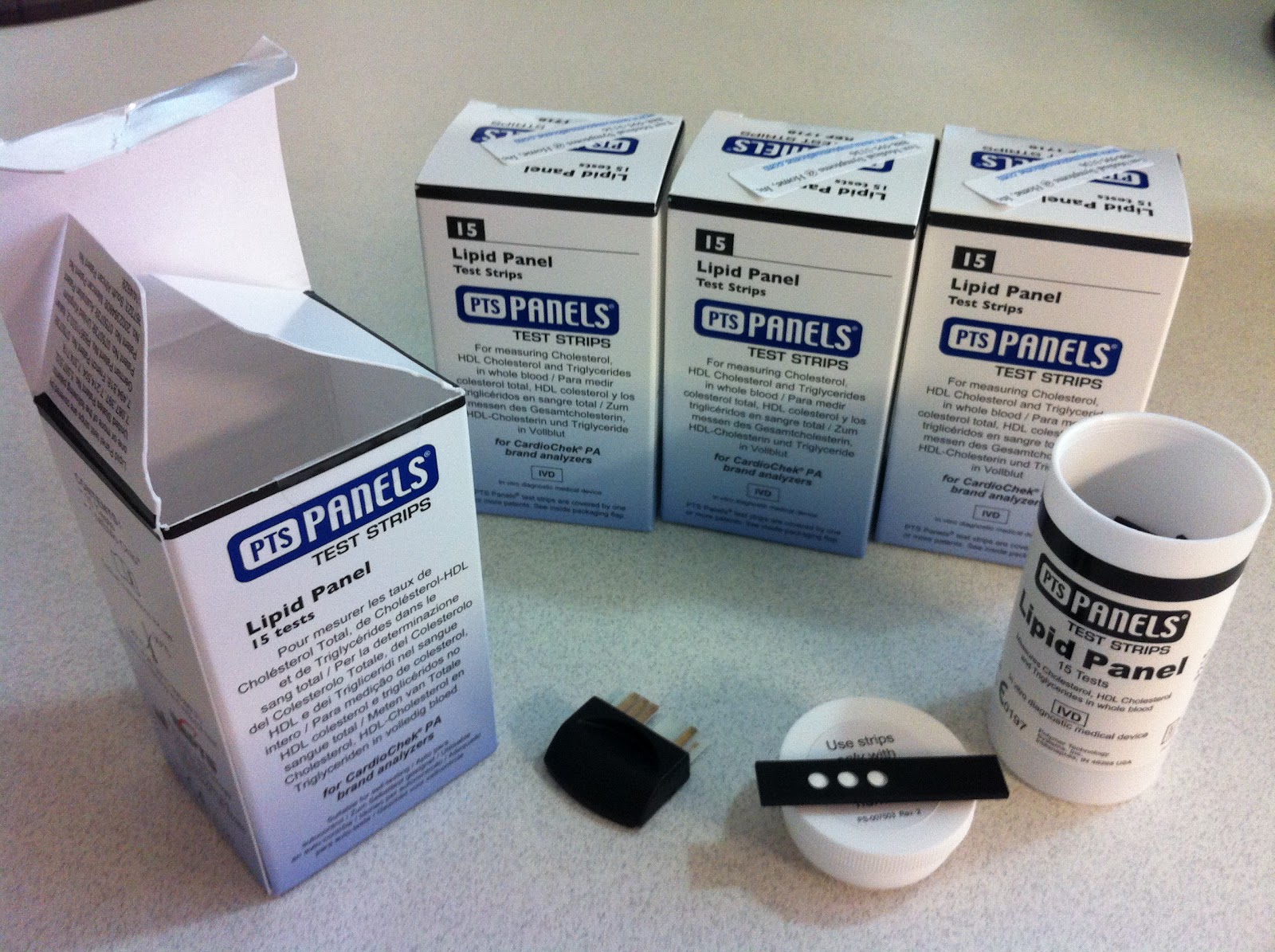
To solve the problem of collecting a full lipoid panel from one drop of blood, I purchased these PTS panels that appeared nice in the sense that they have the ability to drive the calculation of multiple readings from a single sample of blood.

Each box comes with one lipid panel MEMo chip that can be inserted
into a CardioChek PA device and 15 single use lipid profile panels

Unfortunately, I quickly discovered that these really nice 3-in-1 lipid profile panels are not compatible with the $125 consumer CardioChek device.  To support multiple readings from a single drop of blood would require the more expense CardioChek PA device, that runs at close to $700.

Being the end of the fiscal year, the additional money was a little easy to come by.  I went back to our finance staff and purchased the more expensive, clinical-grade device.  I also picked up some supporting medical equipment like gloves, lancets, pipettes, and band aids.

CardioChek PA blood testing device
CardioChek PA blood testing device, several tests
with some additional medical equipment

To take your lipid profile, you need one lipid panel test chip, called a MEMo Chip by the manufacturer, and one lipid panel test strip.  The MEMo chip contains lot-specific calibration and other information needed to properly perform testing.  The lot-specific information is presumably associated with the 15 test panels that come with the package.  I would not recommend mixing and matching test panels with different MEMo chips, because of this prior calibration by the manufacturer.

There is also guidance around always storing the unused test panels at a temperature between 68-80˚F.  I could see this temperature requirement as a challenge for some home/consumer users.  Lastly, there is an expiration date on the test panels.  For all the tests I have, the expiration date, is less than one year from now, a little under 8 months of viable shelf time.

You can see the relative size of the test panel and MEMo chip in the picture below.  You only need one strip for a test.  I just flipped one test strip over to show the single wide channel where you deposit your blood, and the three openings for the device sensor to read the total cholesterol, HDL cholesterol, and triglycerides.

lipoid panel test chip, with two lipoid panel test strips
Lipoid panel test chip and two lipoid panel test strips

It appears that the CardioChek PA device has the ability to independently test up to four different metrics from the single sample of blood.  While I haven't found any tests that use a full four metrics from one sample, I am still happy that the manufacturer (presumably) recognized this need for multiple tests from a single sample.

CardioChek PA sensor

Collecting and depositing your sample for the device is relatively easy for an individual, non-clinician.  I suggest you get 2 paper towels, and a small band aid before you get started.  If you are unfamiliar with using lancets, they are small and cheap medical implements used for capillary blood sampling (no vein or arties). A lancet includes a spring-loaded needle.  When used, it pops out and makes a very small puncture in your skin, allowing a few drops of blood to appear on your skin over the next ~10 seconds.  They are single use and disposable.

You can see how they are fairly straight-forward to use for the blood sampling that you can then collect with pipettes.

Lancet
About one drop of blood after lancet met my finger
with small pipette in background

After my first two attempts to use the device for a full lipid profile, the device would eventually display "TEST ERROR" on the screen.  Needless to say, I was disappointed to think that I had put over $1K into this exercise, and had no data to show.  As it turns out, my finger was not providing enough blood to generate the full lipid profile.  There is some documentation provided with the device that makes this association from the "TEST ERROR" message.  However, I just can't understand why the manufacturer didn't make this more intuitive for users.

On my third attempt, when I applied a liberal amount of blood on the sample channel, the device worked fine.  I feel that the accuracy of the device is very high.  The readings it provided were all within 10% of measurements that I had collected from my Primary Care Provider (PCP) the previous week.  For me, the time between depositing your blood on the strip until the results are displayed ranged from 40 to around 60 seconds on three test runs.

This problem that resulted in multiple "pokes" with the lancet makes for an amusing story at my expense.  However, I can't emphasize enough; the "TEST ERROR" message really means "Not enough blood".  This is an opportunity for improvement in this product for first time users.

On this topic of human-computer interaction, I was also disappointed with the CardioChek PA user interface.  For $700, the interface feels like bleeding-edge late 1980s technology.

CardioChek PA user interface

For a $700 device, I would think that the manufacturer could easily upgrade the resolution and include color at a modest increase in manufacturing costs.  Ideally, this would include some longitudinal data on changes associated with the data.  See my suggested illustration below, again based on Juhan Sonin's designs for a HealthCard for the patient (consumer).

My updated lipid profile with sparkline visualizations
On the positive side, the CardioCheck PA is worth purchasing if you think you will be frequently taking your lipid profile at home.  It appears very accurate on the measurement results.  Once you learn the interface and how to correctly provide enough of a blood sample, the device works well.

My biggest issue with this product is the variance in the cost of the CardioChek PA device at $700, versus a slightly more limited consumer CardioChek device at $125.  I feel that this price point makes the CardioChek cost-prohibitive for most consumers (patients).

I would grade the CardioChek PA device a B- for the purposes of home users.

Somewhat related to where this may go in 5-10 years, I was able to identify an amazing illustration, showing various ranges for numerous blood metrics:

Reference ranges for blood tests

Knowing that a single drop of blood could theoretically yield all these metrics makes for some interesting ideas about how the consumer could have access to these metrics on a daily basis, at their home.

Another interesting opportunity for this market would be to introduce a blood sensor without the embedded interface that could communicate with an iPhone, similar to how the Withings BP Cuff works.  I have that Withings device at home, and plan on developing a review of that device later.

This work is licensed under a Creative Commons Attribution-NonCommercial-NoDerivs 3.0 Unported License. © Rob McCready, 2012.
Creative Commons License