September 13, 2012

Review: CardioChek PA Blood Meter

I have been working for the Office of the National Coordinator for Health Information Technology (ONC), on the popHealth and Cypress projects for several years now.  Both projects are based around Clinical Quality Measures (CQMs).

By education, I am a physicist and engineer, and not a clinician.  However, I have repeatedly noticed the importance of lipid profiles within the context of the logic of several of the Meaningful Use CQMs.  Further, in the very recent past, these metrics had been considerably high for me; a male in my late 30's.  Between my work looking at CQMs emphasizing the importance of just measuring lipid profiles, and my own personal warning signs associated with this health metric, I thought it would be good to collect some "hands on" experiences with the collection of the data for this metric.

When my department at MITRE had some additional overhead resources available at the end of our fiscal year, I purchased a portable blood testing device that could provide me with my own lipoid profile information (total cholesterol, HDL cholesterol, LDL cholesterol, and triglycerides).

I eventually picked the CardioChek PA blood meter device.  Interestingly, this was not the first CardioChek blood device that I purchased.  I originally found the consumer CardioChek (no "PA") device on Amazon.com.  The consumer device lists at about $125.  That seemed reasonable, but the device requires three separate strips to measure total cholesterol, HDL cholesterol, and triglycerides (you can calculate the LDL cholesterol from those three).  While that may not sound bad, I quickly found out that it involved giving myself at least two, sometimes three, pricks with lancets to draw enough blood for the three separate tests.

Additionally, I purchased this device for my department at work, and felt that an experience getting three pokes with a needle might not go over well with my colleagues, resulting in some future retribution via office pranks.

To solve the problem of collecting a full lipoid panel from one drop of blood, I purchased these PTS panels that appeared nice in the sense that they have the ability to drive the calculation of multiple readings from a single sample of blood.

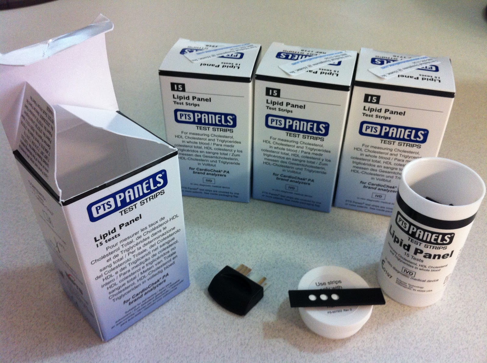
Each box comes with one lipid panel MEMo chip that can be inserted
into a CardioChek PA device and 15 single use lipid profile panels

Unfortunately, I quickly discovered that these really nice 3-in-1 lipid profile panels are not compatible with the $125 consumer CardioChek device.  To support multiple readings from a single drop of blood would require the more expense CardioChek PA device, that runs at close to $700.

Being the end of the fiscal year, the additional money was a little easy to come by.  I went back to our finance staff and purchased the more expensive, clinical-grade device.  I also picked up some supporting medical equipment like gloves, lancets, pipettes, and band aids.

CardioChek PA blood testing device
CardioChek PA blood testing device, several tests
with some additional medical equipment

To take your lipid profile, you need one lipid panel test chip, called a MEMo Chip by the manufacturer, and one lipid panel test strip.  The MEMo chip contains lot-specific calibration and other information needed to properly perform testing.  The lot-specific information is presumably associated with the 15 test panels that come with the package.  I would not recommend mixing and matching test panels with different MEMo chips, because of this prior calibration by the manufacturer.

There is also guidance around always storing the unused test panels at a temperature between 68-80˚F.  I could see this temperature requirement as a challenge for some home/consumer users.  Lastly, there is an expiration date on the test panels.  For all the tests I have, the expiration date, is less than one year from now, a little under 8 months of viable shelf time.

You can see the relative size of the test panel and MEMo chip in the picture below.  You only need one strip for a test.  I just flipped one test strip over to show the single wide channel where you deposit your blood, and the three openings for the device sensor to read the total cholesterol, HDL cholesterol, and triglycerides.

lipoid panel test chip, with two lipoid panel test strips
Lipoid panel test chip and two lipoid panel test strips

It appears that the CardioChek PA device has the ability to independently test up to four different metrics from the single sample of blood.  While I haven't found any tests that use a full four metrics from one sample, I am still happy that the manufacturer (presumably) recognized this need for multiple tests from a single sample.

CardioChek PA sensor

Collecting and depositing your sample for the device is relatively easy for an individual, non-clinician.  I suggest you get 2 paper towels, and a small band aid before you get started.  If you are unfamiliar with using lancets, they are small and cheap medical implements used for capillary blood sampling (no vein or arties). A lancet includes a spring-loaded needle.  When used, it pops out and makes a very small puncture in your skin, allowing a few drops of blood to appear on your skin over the next ~10 seconds.  They are single use and disposable.

You can see how they are fairly straight-forward to use for the blood sampling that you can then collect with pipettes.

Lancet
About one drop of blood after lancet met my finger
with small pipette in background

After my first two attempts to use the device for a full lipid profile, the device would eventually display "TEST ERROR" on the screen.  Needless to say, I was disappointed to think that I had put over $1K into this exercise, and had no data to show.  As it turns out, my finger was not providing enough blood to generate the full lipid profile.  There is some documentation provided with the device that makes this association from the "TEST ERROR" message.  However, I just can't understand why the manufacturer didn't make this more intuitive for users.

On my third attempt, when I applied a liberal amount of blood on the sample channel, the device worked fine.  I feel that the accuracy of the device is very high.  The readings it provided were all within 10% of measurements that I had collected from my Primary Care Provider (PCP) the previous week.  For me, the time between depositing your blood on the strip until the results are displayed ranged from 40 to around 60 seconds on three test runs.

This problem that resulted in multiple "pokes" with the lancet makes for an amusing story at my expense.  However, I can't emphasize enough; the "TEST ERROR" message really means "Not enough blood".  This is an opportunity for improvement in this product for first time users.

On this topic of human-computer interaction, I was also disappointed with the CardioChek PA user interface.  For $700, the interface feels like bleeding-edge late 1980s technology.

CardioChek PA user interface

For a $700 device, I would think that the manufacturer could easily upgrade the resolution and include color at a modest increase in manufacturing costs.  Ideally, this would include some longitudinal data on changes associated with the data.  See my suggested illustration below, again based on Juhan Sonin's designs for a HealthCard for the patient (consumer).

My updated lipid profile with sparkline visualizations
On the positive side, the CardioCheck PA is worth purchasing if you think you will be frequently taking your lipid profile at home.  It appears very accurate on the measurement results.  Once you learn the interface and how to correctly provide enough of a blood sample, the device works well.

My biggest issue with this product is the variance in the cost of the CardioChek PA device at $700, versus a slightly more limited consumer CardioChek device at $125.  I feel that this price point makes the CardioChek cost-prohibitive for most consumers (patients).

I would grade the CardioChek PA device a B- for the purposes of home users.

Somewhat related to where this may go in 5-10 years, I was able to identify an amazing illustration, showing various ranges for numerous blood metrics:

Reference ranges for blood tests

Knowing that a single drop of blood could theoretically yield all these metrics makes for some interesting ideas about how the consumer could have access to these metrics on a daily basis, at their home.

Another interesting opportunity for this market would be to introduce a blood sensor without the embedded interface that could communicate with an iPhone, similar to how the Withings BP Cuff works.  I have that Withings device at home, and plan on developing a review of that device later.

This work is licensed under a Creative Commons Attribution-NonCommercial-NoDerivs 3.0 Unported License. © Rob McCready, 2012.
Creative Commons License


September 2, 2012

Appling Kiviat Visualizations to Clinical Quality Measures

I have been working with Clinical Quality Measures (CQMs) for several years, leading two open source healthcare projects for the Office of the National Coordinator for Health Information Technology (ONC), first popHealth and more recently Cypress.  Both of these projects cover intimate details relating to CQMs.  While working in this space, I have noticed that there is a need for better techniques for the visualization and presentation of Clinical Quality Measure results.

CQMs are reports that measure the quality of healthcare providers against patient-level data.  CQMs are designed to measure the performance and quality care that a healthcare provider applies to a population of patients.  Many factors are included in CQMs such as health outcomes, processes and systems in place at a facility, patient perceptions, and treatments provided.  The idea behind introducing CQMs into the healthcare provider workflow is that continuously measuring providers against these metrics, the US healthcare system can be shaped to gradually provide higher quality and improved efficiency by monitoring these metrics.

CQMs are a required component of Meaningful Use requirements for the Medicare and Medicaid Electronic Health Record (EHR) Incentive Programs.  This program is a significant part of the HITECH Act.  The Meaningful Use program can supply healthcare providers with up to $44,000 in incentives if they demonstrate that they meet requirements to "Meaningfully Use" an Electronic Health Record software system in their practice.

While the notion of measuring clinical performance has been around for ages, the importance CQMs withing the Meaningul Use program has been a forcing factor to motivate EHR software vendors.  All are motivated to support calculation for the Meaningful Use CQM reports in their products.  Since CQMs are a feature EHR vendors must support for this federal program, there have been several visualization techniques to present CQM results to their users:

nextgen cqm
NextGen Mammography Screening CQM Visualization

This NextGen design requires a good amount of looking back/forth to understand the time interval being applied to the individual bar charts on the mammography report.  This alone is my biggest grievence with the design.  However, the legend on the upper left of the bar chart, actually cuts off the top of results for women who have had a mammography screening in the past 12 months.  This legend background is the same tone black as the background of the bar chart illustration.  This decision ultimately results in seeing a visual representation of that metric that is lower than the actual numeric value.

ge hospital cqm dashboard
GE Hospital (Inpatient) CQM Dashboard


This GE dashboard makes liberal use of color to differentiate the various clinical families, and provides no visual indication on the actual CQM results.  The user is force to click on each box to both understand the value, as well as the name of the specific metric.  I found this technique to be one of the more painful to use.

Admittedly, after several years leading popHealth, a Clinical Quality Measure reference implementation software service, we have likewise struggled with the visualization we developed.  Our popHealth CQM visualization has been warmly viewed by both clinicians and EHR vendors, but uses significant screen real estate for displaying numerous CQM results:

pophealth practice dashboard
popHealth Practice-Level CQM Dashboard

One approach to the visualization of Clinical Quality Measures that I haven't seen wide adoption is the use of a Kiviat chart.  Kiviat charts, or sometimes referred to as Radar Charts, are two dimensional, multi-metric illustrations which use a variable number of evenly distributed radii.  Each spoke is associated with one metric. The length of a value overlaid on each radii is proportional to the magnitude of the metric relative to the maximum value of the variable across all data points.

Use of Kiviat diagrams works well with an apples-to-apples comparison of multiple metrics against an arbitrary number of metrics.  Kiviat diagrams can also make it easier to identify patterns in data if the radii are arranged in a consistent order from diagram to diagram.

After searching for Clinical Quality Measures and Kiviat visualizations, I was able to find a good article from PIIM Research detailing numerous visualizations for clinical metrics, "Advancing Meaningful Use: Simplifying Complex Clinical Metrics Through Visual Representation".  This paper included a Kiviat visualization for some CMQs, and also notes the value in providing national averages as an overlay to differentiate the delta from the measured results for one provider with a Kiviat approach:

piim research clinical visualization
PIIM Research Advancing Meaningful Use: Simplifying Complex Clinical Metrics Through Visual Representation

While I am unaware of target metrics or a national average for the Meaningful Use CQM results, I like the concept of presenting targets for CQMs, here presented as a black underlay.  One aspect that is absent from this approach is a way to present when the providers' results exceed the target metrics.  The approach above with the national average is good for presenting when there is a deficit in the results.  However, it does not present a good way to visualize when CQM results exceed targets and expectations.

I do not endorse the liberal use of color in this design either.  From my experiences developing command and control systems, I have found that using red or green in any design will immediately convey goodness or badness associated whatever metric is being presented.  This PIIM design uses a spectrum of colors to indicate where each CQM's results are, in addition to having the Kiviat line as way to present this information.

I found the use of red and green to be very distracting when interpreting the notional results in the illustration.  In particular, the name color green will appear on the CQM metrics at the same numeric value.  However, targets for each measures in the example will vary on a measure-by-measure basis.  I could easily imagine a light green CQM result (in the mid-80s) that might actually be very poor against a national average.  Similarly, an orange/red CQM result (in the mid-60s) could easily exceed the national average and expectations.

The dark/light alternating background doesn't have any real value aside from showing the upper bounds on the entire space.  While this is probably good from some users, I found it to be unnecessary.

What's my suggestion?

A few years ago, I worked with Involution Studio creative director Juhan Sonin when he was at MITRE.  I have also attended and enjoyed designer Stephen Few's course on business dashboard design.  See my attempt at an amalgam of Juhan's minimalist/clean visualizations using Kiviat graphics with Stephen's constant guidance to focus on the critical information below:

Juhan Sonin's Kiviat illustration, re-purposed against synthetic data for
Meaningful Use Stage 1 Clinical Quality Measures

Taking this design further, and by overlaying best practice targets with the individual results, users can quickly understand where the quality of care meets/exceeds/fails expectations:


The decision to use red as the best practice number is that when the red Kiviat is visible, it implies that the provider's performance is below the targets that she/he should be meeting.  The use of blue for the measured results was primarily to made to select a color that would compliment the red.  I couldn't find any good tones of green that would work without making the illustration look like it had a "Christmas" theme.

To my knowledge, the best practice metrics for any of the nationally recognized Clinical Quality Measures (Meaningful Use program, PQRS program, Pioneer ACO program... etc) are not yet established.  I don't know if there is work being planned to identify what these targets need to be.

A strength and limitation to applying Kiviat illustrations in this way is that the power to rapidly assess metrics "at a glance".  For instance, the ability to recognize patterns through shapes alone is could provide the ability for an analyst to rapidly review the results of numerous physicians to identify specific providers who need to address improvements on the care they provide their patients on specific diseases and demographics.

What are some potential downsides to using Kiviat diagrams with CQMs?

A potential problem is that Kiviats benefit from standardization to the placement of the particular metrics to allow for the rapid visual inspection of the CQM results.  For example, changing the placement of the hemoglobin A1C metric, after an analyst had been trained on one particular illustration, would probably result in increased cognitive load and/or errors.  If the location of the individual CQM metrics are standardized, it will alleviate the need for users to re-read the names of the metrics every time they were presented to users.

Additionally, there are some limitations to Kiviat illustrations endemic to the visualization technique itself.  One weak spot I have noticed is the sensitivity to changes in higher-ranging metrics tends to be more exaggerated over the same magnitude of change on smaller-ranging metrics.  For example, a before/after 40% increase (from 50% to 90%) on the Diabetes LDL Management CQM below yields a more striking increase to the surface area in chart.  Meanwhile, a 40% reduction in the Diabetes Urine Screening CQM (from 50% to 10%) is the same change in the number of diabetic patients, but is less pronounced.

See below for a before/after example that highlights changes of the same magnitude, but a perception of a larger change on the larger valued metric:


Another challenge to using Kiviat visualizations assumes that the higher the CQM result, the better the performance and quality of care by the provider.  This isn't always the case with the 44 Meaningful Use Stage 1 Ambulatory CQMs.  For instance, NQF 0059: Diabetes HbA1c Poor Control considers patients meet the requirement for this CMS if the hemoglobin A1c value in diabetic patients is in an undesirable range > 9%.

This type of CQM is "legal" logic.  However, the fact that the measurement grades an undesirable result complicates the approach to visualize this result with other more desirable metrics, such as NQF 0575: Diabetes HbA1c Control, which considers a hemoglobin A1c value < 8%.

One simple (albeit crude) solution to this problem would be to ensure that all future Clinical Quality Measures endorsed by the National Quality Forum (NQF) are required to associate "goodness" with meeting the numerator criteria for any CQM.

This work is licensed under a Creative Commons Attribution-NonCommercial-NoDerivs 3.0 Unported License. © Rob McCready, 2012.
Creative Commons License